Random Gaussian
In this tutorial (and the next) we are going to look at different ways to generate and use random numbers.
Random numbers are important when we are trying to make something that is difficult to predict.
This can be for security reasons, like when random numbers are used as temporary passwords for online transactions, or for aesthetic reasons, like when we want to create a shape that has enough variation that it doesn’t look programmed.
Let’s start with our old friend: random().
Random gives us numbers following an uniform distribution, meaning that every number within its range has an equal probability of being selected.
We can see that in this sketch, where we draw lines whose lengths in the y-direction are selected from a uniform distribution with range \([\frac{-height}{2}, \frac{height}{2}]\).
Each number between \(\frac{-height}{2}\) and \(\frac{height}{2}\) has the same chance of being selected, so we get a pretty “random” looking graph.
We can look at this in another way. Let’s draw random whole numbers in the range \([0, 12]\) and count how many times each number shows up:
This is like rolling a 12-sided die many times and counting how many times each choice is rolled. As we keep clicking the mouse the sum of occurrences of each whole number between \(0\) and \(12\) approaches the same value.
Yet another wey to look at random(): if we use it to select \(x\) and \(y\) locations for drawing ellipses, eventually we will cover our whole canvas uniformly:
Let’s go back to the bar chart where we counted the number of occurrences of uniformly distributed random numbers:
We can change the number of choices that we have to select from, but the result is always the same: with enough rounds of selection (clicks) the sum of occurrences all approach the same value.
What if we add \(2\) uniformly distributed random variables?
This is like rolling two 12-sided dice, adding the two numbers that are rolled each time, and counting how many times each of the possible sums occur:
For two 12-sided dice we have \(23\) possible sums, \([0, 22]\).
From the first set of \(500\) rolls we can already see that the distribution of this sum is not uniform: some numbers are more likely to occur than others. And, as we keep rolling our two dice (clicking), we will see that the distribution of the occurrences of our sums starts to look like a bell 🔔.
This is a different kind of random distribution, called a normal or Gaussian distribution.
In this distribution, not all numbers are equally likely to occur, the distribution has a specific “expected value” and a “spread”.
The expected value is the average or mean value of the distribution, which in the case of the two 12-sided dice is \(11\).
And, the “spread” is something called a standard deviation, which specifies how likely numbers far from the mean are to occur. In the two 12-sided die example all of the numbers fall between \(0\) and \(22\), or within \(11\) units of the average. The standard deviation isn’t \(11\), but about \(\frac{1}{3}\) of that number.
This plot shows the relationship between mean and standard deviation for a gaussian distribution with mean \(0\) and standard deviation \(\sigma\):
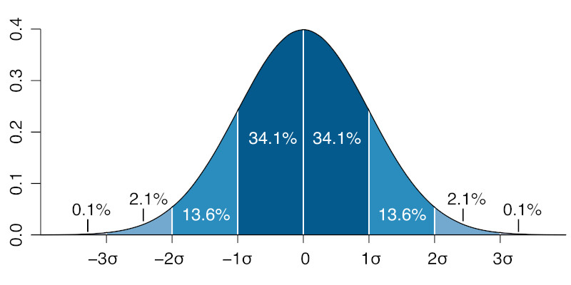
What this graph shows is that about \(68\%\) of the values chosen from a gaussian distribution will be within \(1\) standard deviation from the mean, about \(95\%\) will be within \(2\) standard deviations, and almost all of the values (\(99.7\%\) of them) will be within \(3\) standard deviations from the mean.
We can check this with the p5js randomGaussian() function.
Let’s use it to select random whole numbers between \(0\) and \(22\), but with a mean of \(\frac{22}{2}\) and a standard deviation of \(\frac{11}{3}\), and sum the occurrences of each number:
The more we click, the closer this graph will get to the symmetric bell curve of a normal distribution.
We can visualize our gaussian distributions in another way: let’s use random gaussian numbers for selecting \(x\) and \(y\) positions for drawing ellipses.
Since we want them to be centered on our canvas, we’ll use mean values of \(\frac{width}{2}\) and \(\frac{height}{2}\). And if we want \(99.7\%\) of the numbers selected to fall within our canvas, the standard deviations should be \(\frac{width}{6}\) and \(\frac{height}{6}\):
The vertical lines show standard deviations in the \(x\) direction. And we can see that the density of ellipses decreases as we move away from the mean in the center of the canvas.
As we keep clicking, we can see that the middle two regions fill up quicker, because together they hold \(68\%\) of the ellipses drawn. The next \(2\) regions away from the mean hold about \(13.6\%\) of the ellipses each, or \(27\%\) collectively. And the \(2\) furthest regions from the mean each hold \(2\%\) of the ellipses drawn.
We can see a similar situation for the distribution of \(y\) values:
It’s a little hard to see how line lengths are distributed in an example like this:
But, if we add circles to the end of the lines and standard deviation markers to our canvas, we again see that the distribution of the length of the lines is not uniform, regions close the the center have more ellipses:
If we draw a similar sketch using an uniform distribution, we won’t see any relation between the quantity of ellipses drawn and the distance from the center:
Normal distributions are everywhere and we can use them to add elegant variability to our sketches without having them look completely random or pre-determined.
Let’s revisit HW03B, but now implement it using both random() and randomGaussian():
With more time, both versions could be adjusted to look similar, but the diameter and the small variations in \(x\) and \(y\) are easier to adjust while avoiding overlaps using the gaussian distribution because we know where most of the values are gonna be.
We can also use randomGaussian() to pick variations around a chosen color:
The variations created using randomGaussian() are more often more similar to the chosen color, but still have a wide range of variation, even if the more different colors are less frequent.
And, finally, we can compare \(200\) circles with uniformly random diameters, to \(200\) circles with normally distributed diameters:
And the effect when we re-draw them every couple of frames:
Both are cool effects, but since larger circles are more rare in the normally distributed diameters, when they show up they give the animated shape a sense of expansion or pulsation.
(this last example was inspired by Evelyn Yang)